Redesigns often start with a tidy list of things to remove: fewer items in the menu, fewer separate pages and shorter copy.
That usually makes sense. The product has grown, the old structure no longer explains it properly and the new brand looks out of place across half the site. In the mock-ups, the new version feels clearer. It may well be.
The old site is doing more than holding the current design together, though. Some pages already answer questions people bring from Google. Others help visitors understand the product, compare their options or decide whether to get in touch.
Remove those pages without understanding their job and the redesign can look better while making the business harder to find.
Let’s say a company makes scheduling software for restaurant teams. Its site has a separate page about shift planning. During the redesign, the team decides to remove it and explain everything on one general platform page.
Visually, that might be the right direction. Search-wise, it depends on what the old page was already doing.
Maybe restaurant managers found it because they were looking for software to manage shifts across several locations. Maybe they used it to check whether the product supported their exact situation. If the new platform page only says that the product helps businesses “simplify operations”, the page is cleaner but the useful answer has gone.
This is how we approach a redesign at Fortnight. Before changing the layout, we find out what the existing site has already earned, what each important page helps someone do and what the new version needs to carry forward.
We do not begin with screenshots of the current website. We begin with a page inventory.
For each important page, we record its address, the searches that bring people to it, the type of visitor it attracts and what that visitor can do next. We also look at whether the page supports something the business cares about, such as a product comparison, a demo request or a purchase decision.
Google Search Console shows which queries and pages appeared in search and how often people clicked them. Analytics shows more of what happened afterwards: whether people explored the product, looked at pricing, submitted a form or disappeared after the first page.
Google treats those as different sources of information for a reason. Search Console is about what happens in Google Search. Analytics is about what people do on the site afterwards. Google explains how to use the two together here.
That distinction matters because traffic does not automatically make a page valuable.
A shift-planning page might attract someone searching for a free rota template. It might also attract a restaurant manager comparing software. Both people can arrive through the same result, but only one is looking for what the company sells.
So we look at the question behind the visit. If the page attracts people looking for templates, that may be a content or acquisition opportunity. If it attracts managers looking for software, it may be part of the route to a sale. Those are different jobs, even when they happen on the same URL.
A page may bring someone to the site, explain a feature, help them compare options or lead them to the next step. It does not need to produce an enquiry immediately to be useful.
By the end of this stage, we should be able to say what each important page is doing and who it is doing it for. That is a much better starting point than deciding which pages feel old.
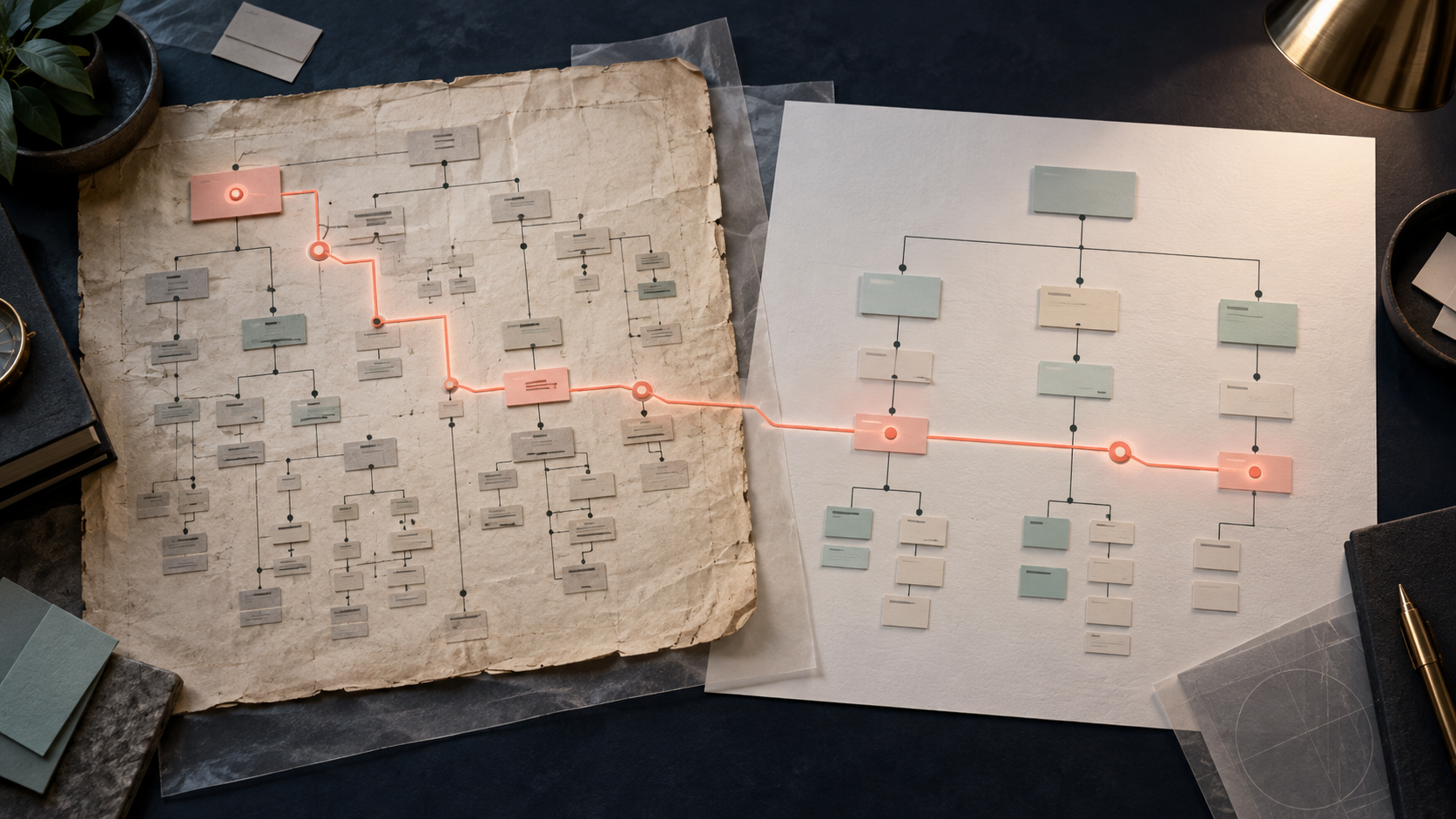
Once the page inventory is clear, we create a simple decision map.
Each page gets a future: keep it, improve it, combine it with another page or remove it. The decision is based on the answer the visitor needs, not on how tidy the sitemap looks.
In the restaurant software example, the shift-planning page could become part of a broader platform page. That is fine if the new page still gives a manager a clear answer about building rotas, changing shifts and keeping staff across several locations informed.
If that answer disappears into a paragraph about “simplifying operations”, the merge has removed useful information rather than simplifying it.
The page might also deserve to stay separate if it attracts a clear audience and supports an important decision. Or it might need to become a stronger solution page with better examples, more relevant proof and a clearer next step.
The output is not complicated. It is a map that connects the old page, the question it answers, the decision we have made and the place where that answer will live in the new structure.
We make this map before the visual design is final because a page is much cheaper to move in a sitemap than after it has been designed, built and filled with content.
A redesign does not need to preserve every sentence, section or page.
Old copy is often too long. It may have grown through years of small additions and stopped having a clear shape. Some pages deserve a complete rewrite.
What we preserve is the useful answer underneath the copy.
For the shift-planning page, a restaurant manager still needs to understand who the feature is for, what they can plan, how changes reach staff and whether the product works across several sites.
That becomes part of the content brief for the new page. The page can then use a different layout, shorter sections, a more useful example and a clearer call to action. The visual design can make the product feel much more current without making the information less specific.
This is where design and SEO usually agree. A page with a clear subject, useful headings, relevant internal links and an answer that matches the visitor’s question is easier for people to use and easier for Google to understand.
Google’s SEO Starter Guide recommends the same basic approach: useful, well-organised content that is easy to follow. There is no clever title or meta description that can replace an answer the page no longer contains.
The new page should not look like a copy of the old one. It should make the same important decision easier.
The content map also gives us the basis for the URL plan.
If /restaurant-staff-scheduling becomes /solutions/restaurant-scheduling, we record that change before launch. The old address should lead directly to the new page that answers the same question.
It should not send someone to the homepage and ask them to start looking again.
That may sound like a small technical detail. It is really part of the experience. Someone arriving through an old search result has already told us what they want. A good redesign continues that conversation.
The same applies when several pages become one. Their old addresses can lead to the new page if it genuinely covers the questions those pages used to answer.
If one old page attracted people looking for a free rota template and another attracted managers looking for scheduling software, combining them into one product page may not be the right answer. The new structure needs to decide whether those are two useful audiences or one confused page.
Google’s guidance on site moves recommends preparing this URL map before launch, testing the new site and sending old addresses to their corresponding new destinations.
The technical implementation may happen in Webflow or another CMS. The important decision comes earlier: knowing where each useful page is going and why.
The technical part should support the design, not appear as a surprise at the end.
Before launch, we check that the new pages can be found and read, that their titles and headings still describe what they contain, that internal links point to the new structure and that old addresses reach the right destinations.
We also check that important pages have not accidentally been hidden from search while the site was being built. A staging setting, an incorrect canonical URL or a missing internal link can make a perfectly good page much harder to discover.
The same check applies to the experience itself. A visitor should be able to arrive through Google, understand where they are and find the next useful step. They should also be able to reach the page through the new navigation and related content.
The new site should make sense from both directions. It should not depend on one perfect route from the homepage.
That is why SEO is part of the redesign from the beginning. It is not a final technical pass after the visual work is finished.
A redesigned site may behave differently in search for a while. Google needs time to recrawl and reindex pages that have changed, so a short-term fluctuation does not automatically mean the redesign has failed.
We look at what changed and where.
Did one important page lose clicks? Did several pages with the same job disappear together? Did an old address lead somewhere irrelevant? Did the new page stop answering the question that brought people there?
Google recommends looking at affected pages and queries rather than treating total traffic as the only signal. That gives the team something specific to investigate instead of turning “SEO is down” into a much larger mystery.
Before launch, we agree which pages and search queries need watching afterwards. That way, the team can tell the difference between normal movement while Google processes the new site and a problem with the redesign itself.
If those answers are clear, the redesign has a much stronger foundation.
The new site can look completely different. It can have a cleaner structure, better pages and a more useful experience. It just should not make search visibility pay for the change.
That is the kind of redesign we help teams plan and build. If your website is ready for a new direction, let’s talk.