You don't need a finished product or a long list of customers to put up a useful website. But you do need to be clear about what someone can do now.
If you're still finding your first customers, your site has a fairly practical job. It should help the right person recognise their problem, understand what you're building, see what exists today, and decide whether it's worth talking to you. It doesn't need to make your startup look further along than it is.
Start with the person you want to reach and the thing they're trying to do, then say how your product helps.
Your team might call the product a "customer intelligence platform". Someone looking for help may be thinking, "we keep hearing the same complaints on sales calls, how do we decide what to fix?" If your product helps answer that question, say so on the page. You can introduce your category name after the visitor recognises the problem.
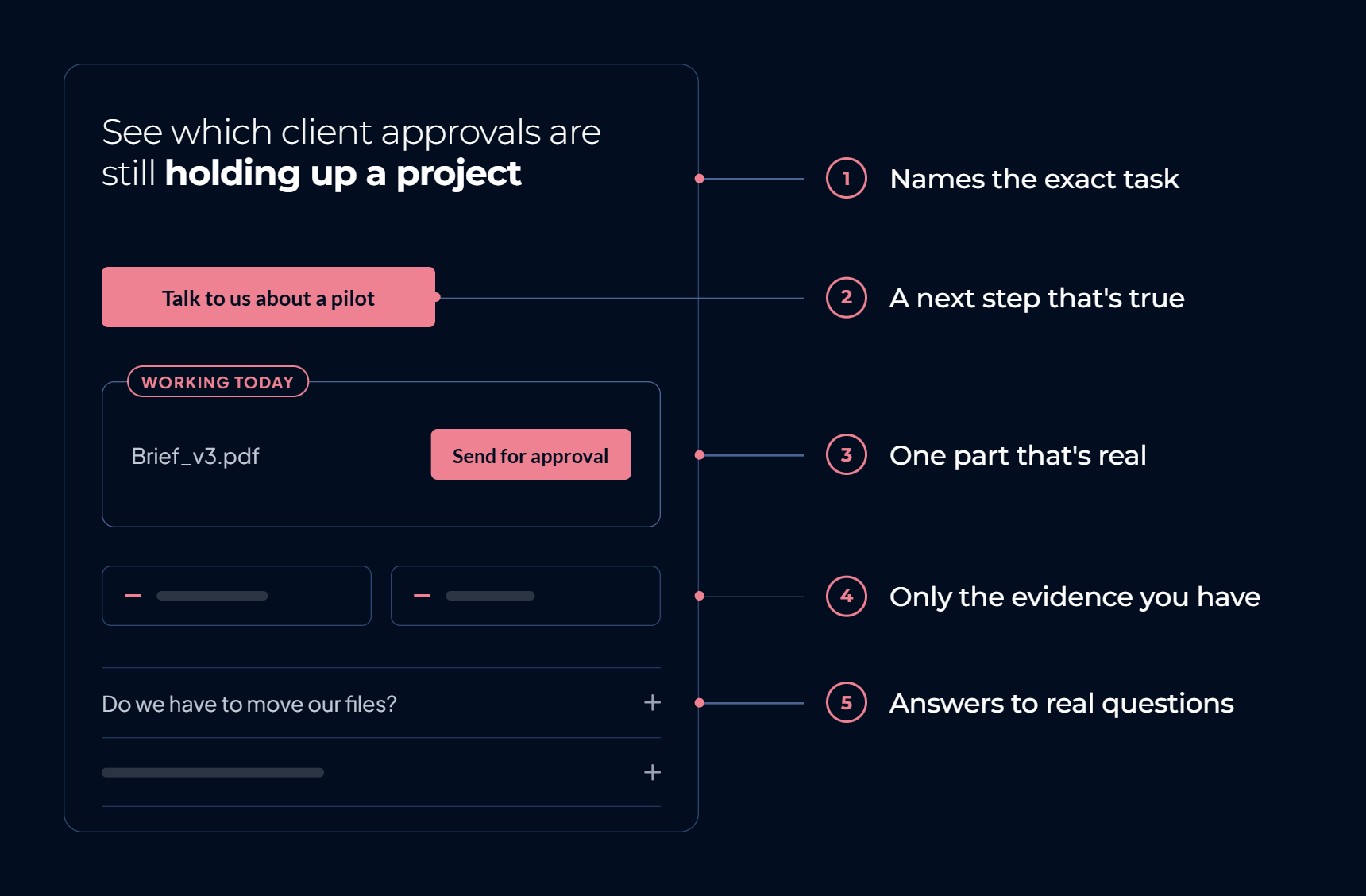
The same goes for the first screen itself. "A better way to manage your business" could describe almost anything. "See which client approvals are still holding up a project" names the exact moment someone is stuck in. The specific version sends the wrong visitor away faster, which is exactly what a good headline should do.
You don't have to fit the whole pitch into one sentence, either. The first screen can split the work into a direct headline, a short explanation underneath, and a next step that follows from both. What matters is that someone who has never met you can understand the offer without wading through startup language.
This is also a useful check on who the site is for. Write "for teams of every size, across every industry" and you're probably trying to make one unfinished product answer every buyer at once. Write for the people you're actually speaking to this month. The site can widen once you know who buys.
Someone who's interested today needs something real to do next: try the product, book a demo, request access, or talk through a pilot.
Choose the one that matches how you actually work. If every new customer needs a conversation and some setup first, "Start free" is a poor button even though it sounds more inviting, because it sets an expectation the product can't meet. "Talk to us about a pilot" tells someone exactly what happens when they click.
Make that action easy to find, and say plainly what follows it: a conversation with a founder, a waitlist, whatever it actually is. That honesty is what lets someone judge whether the next step is worth their time.
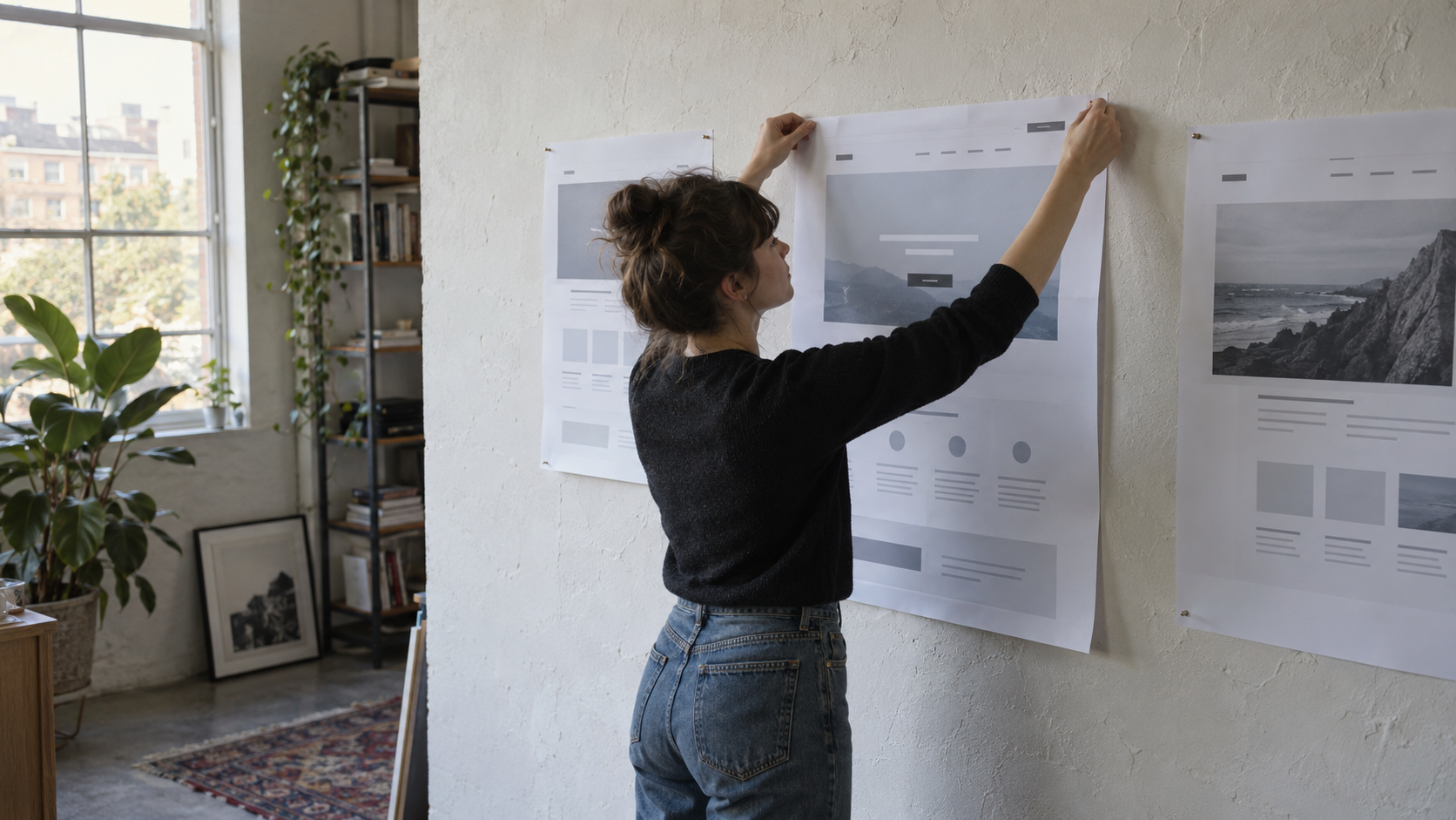
A visitor shouldn't have to take your word for how the product works. Show them the part that makes the offer easier to understand: a real screen, a short walkthrough, an example of the output, or the steps involved in using the service.
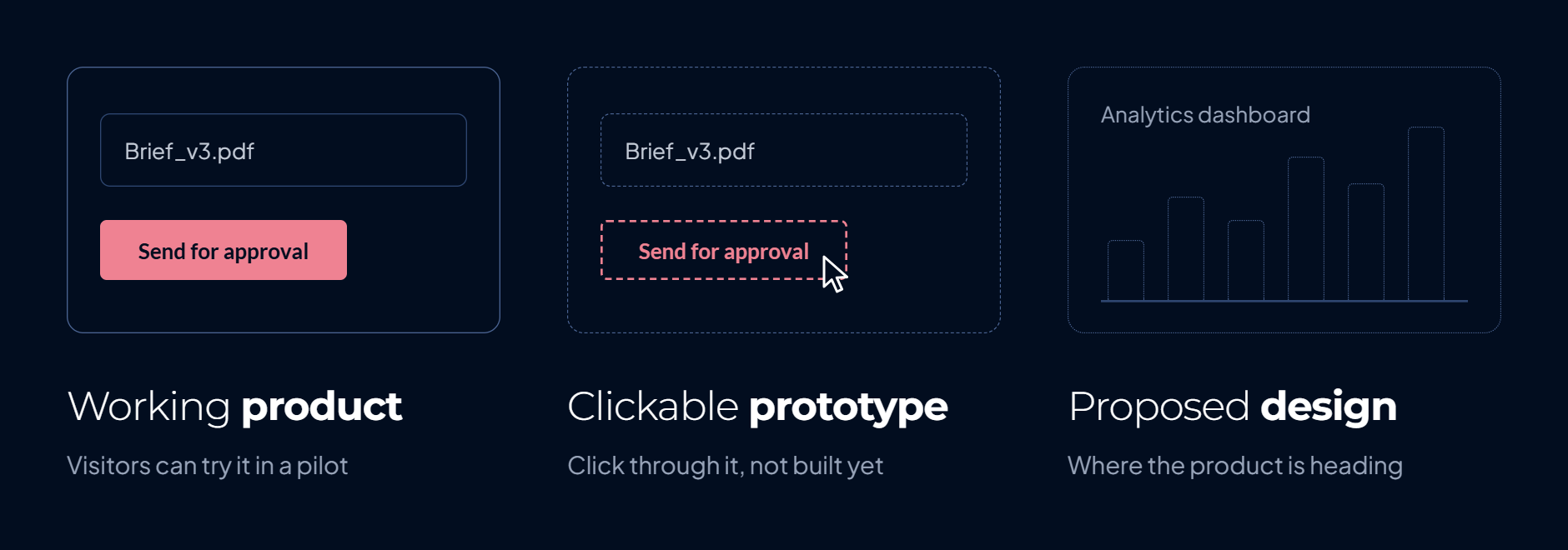
Pick the part that answers a likely question, and match it to what's actually built. If the only thing working today is uploading a document and sending it for approval, show exactly that, screen by screen. A mockup of the analytics dashboard you're planning for next year looks more impressive and tells the visitor nothing true about what they'd be trying this week.
Be clear about what the image represents, because a working product, a clickable prototype, and a proposed design are three different things. You can show any of them, as long as the label is honest. The same goes for a person still handling part of the service behind the scenes: someone considering a pilot needs to know what they're agreeing to try, not find the manual part out on the first call.
If there's nothing worth screenshotting yet, say the process plainly instead. An early site is allowed to say: here's the problem we're working on, here's how we're approaching it, and here's what we're looking for in our first customers.
A real screen shows that the interface exists. It doesn't show whether the two or three people building it are worth trusting with an actual pilot, and this early, most startups don't have testimonials, logos or results to offer either. A thin "as featured in" row trying to cover the gap can do more harm than having nothing there.
Think about what a prospective customer could reasonably use to judge you at this stage: a working part of the product, a pilot you can describe, relevant experience on the founding team, or a clear explanation of how you'll test the idea together. If you have a result, say what happened and whose result it was. If you don't, leave the numbers out.
Proof doesn't have to be a row of logos, either. For someone deciding whether to spend time with you, seeing the actual product and understanding the people behind it may be more helpful than an advisor's quote that says nothing about whether it works.
Your first sales conversations are useful research for this. After a few calls, you'll usually hear some of the same questions more than once, and those are worth putting on the page.
They tend to be plain and practical: who is this for, what do I have to set up, what happens during a pilot, what does it cost or when will we even discuss price. Among them might be something as ordinary as "do we have to move our existing files to use this?", the kind of question that gets a plain answer on a call and no mention anywhere on the site.
You don't need a long FAQ filled with questions you invented to make the page look complete. Answer the ones that have come up, or that someone genuinely needs answered before taking your main next step. If an important detail is still undecided, say what you can tell them rather than quietly implying the decision has been made.
As those conversations change, this part of the site should change with them. A question from your tenth prospective customer may reveal a gap that wasn't obvious when you launched the page.
Plenty of early customers arrive through a personal conversation or a referral, not a search box. But once that stops being the only way in, the words on the page start to matter for whether a stranger finds it at all.
Listen to how prospective customers describe the task, the problem, and the alternatives they've tried. Use those words where they accurately describe your offer, especially in the page title, headline, and explanation of what you do. That gives both visitors and search engines a clearer account of the page. It doesn't mean adding every related keyword or writing a blog before you know what people need. One clear page about a specific offer is a better starting point than several vague pages written to make the site look larger.
A useful article can come later, or sooner, if you've found a real question people search for and you can answer it well. There's no rule that a new site must wait to earn search traffic before publishing one. The decision is whether that article will help the people you want to reach, and whether it's the best thing for your team to work on now.
Put together, here's what a visitor actually moves through. They land on a headline that names their exact task, next to a button that says precisely what happens if they click. Below it sits the one part of the product that's real today, shown as a working screen and labelled as exactly that. Further down, the question that was genuinely stopping them, the one you've heard on calls, gets a plain answer instead of silence or a generic FAQ. Nothing on the page claims to be more finished than it is, and nothing you're still doing by hand stays hidden until the first call.
Once the page does this much honestly, it's tempting to add more before anything actually demands it. You may not need separate pages for every audience, a company story, a resource centre, and a comparison page on day one. Add a page when it has a job the current site can't do: a different buyer needs a different explanation, a common question deserves a fuller answer, or someone is looking for information that doesn't fit naturally on the main page.
For now, make the essential path work. Can the person you want to reach understand the offer, see what's real, get their main questions answered, and take the next step? If yes, you have enough to put the site in front of people and learn from what they do and ask.
Your first website isn't a claim that the product is finished. It's a way to make the conversation you're already having with prospective customers easier to start. Build the page from what you know today, and keep improving it as those conversations teach you more.